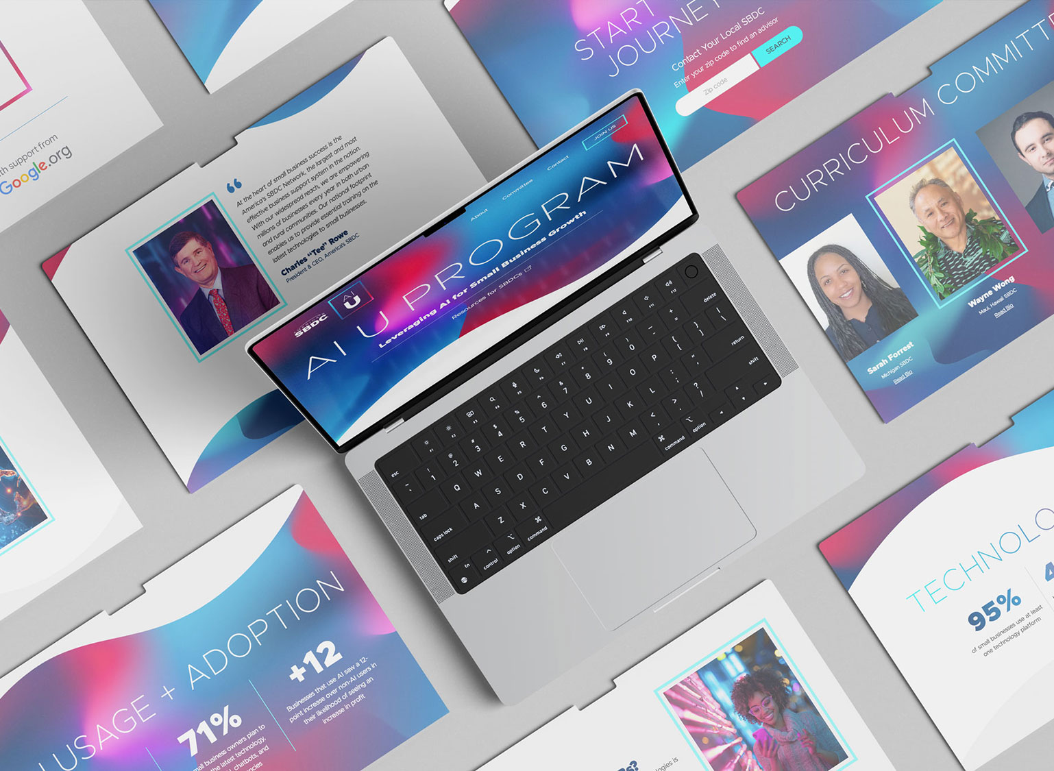
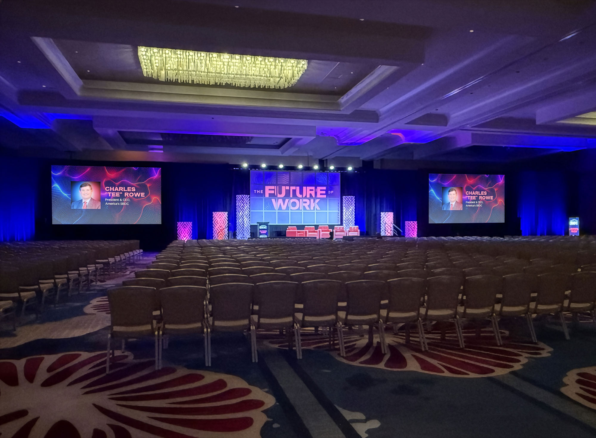
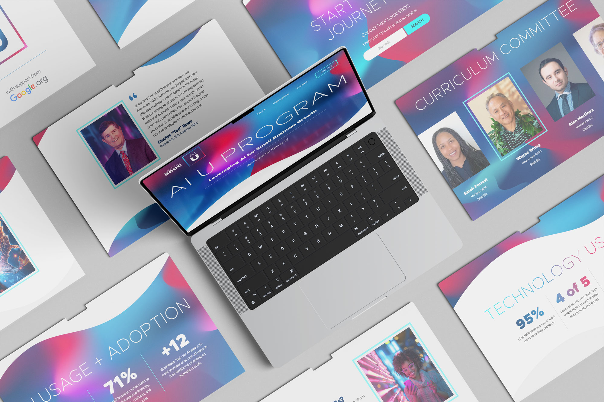
Staarsoft needed a new fresh look, but the owner knew after much time, effort, and money spent on the design and registration of the company logo, that element of the brand had to remain unchanged. Taking inspiration from the Nordic-sounding name of Staarsoft and the owner's loved of Scandinavian design, I created a brand style that prioritizes clean, minimalistic, and primarily mono-chromatic design. The gradient style adds depth. Thoughtful typography with large titles and geometric elements ar the main focus, with photography as an accent.


